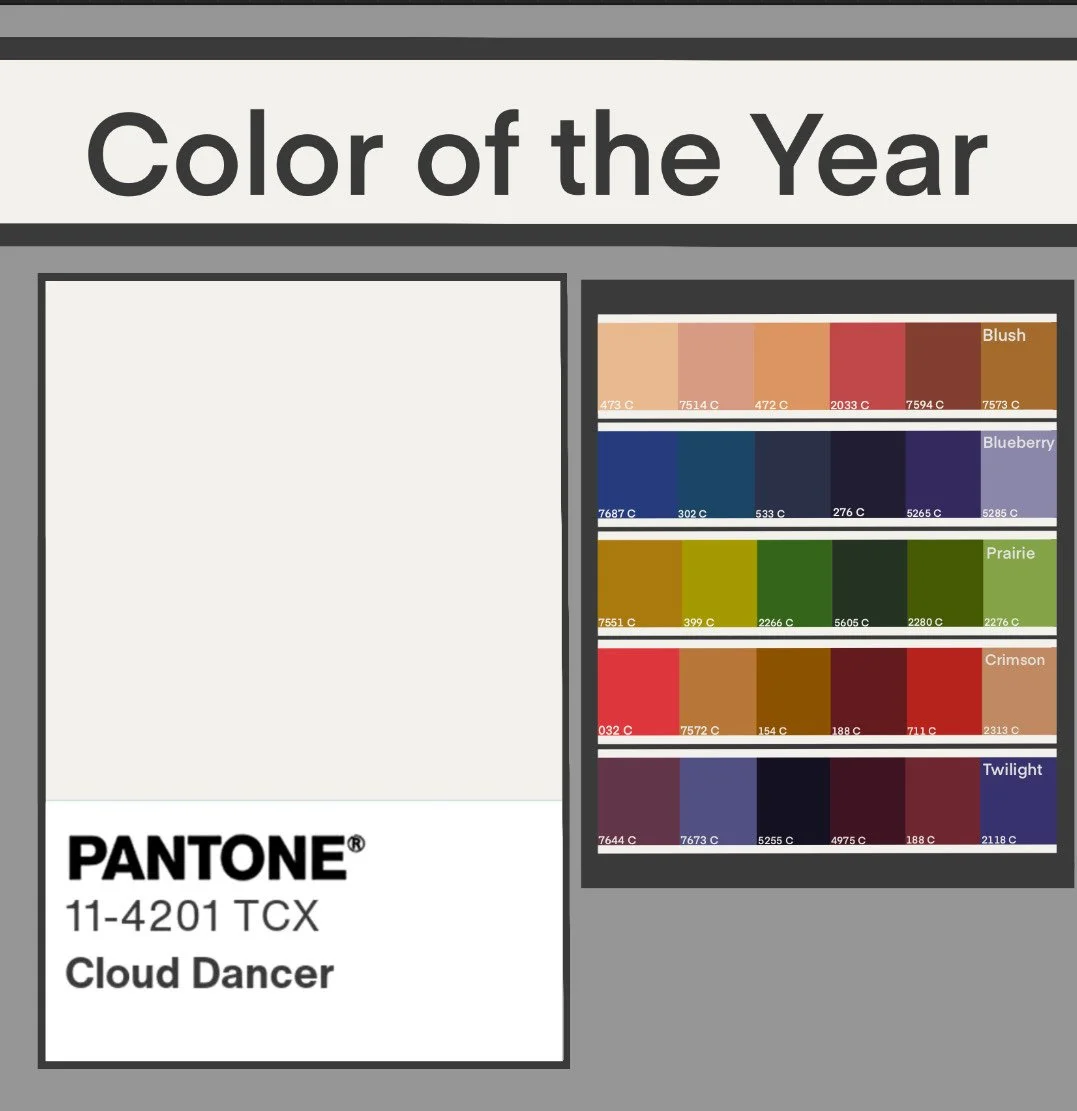
Pantone Color of the Year 2026: Cloud Dancer
Writing and Graphic Design by: August Ervin
Photography by: Jenna Brown
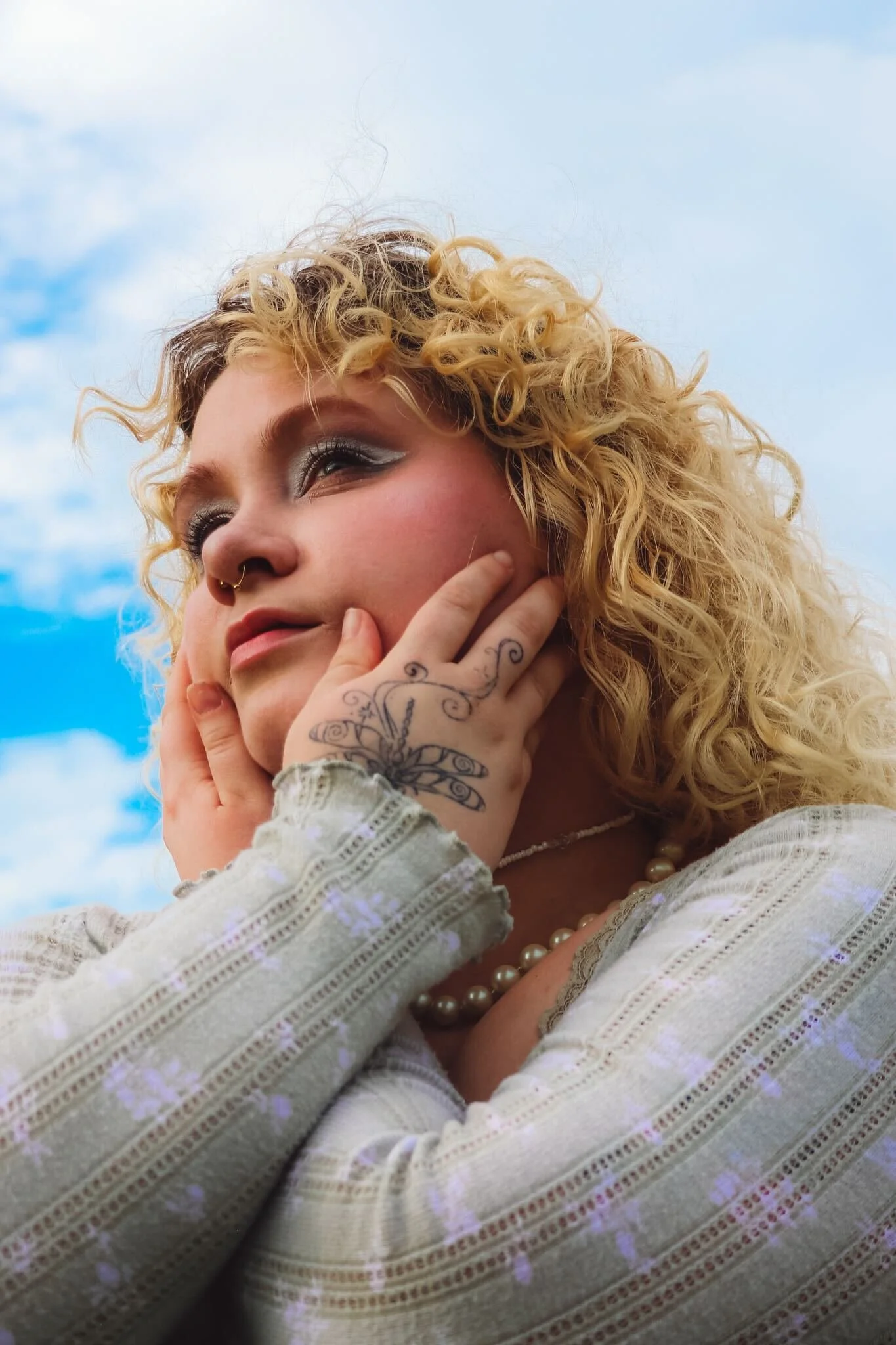
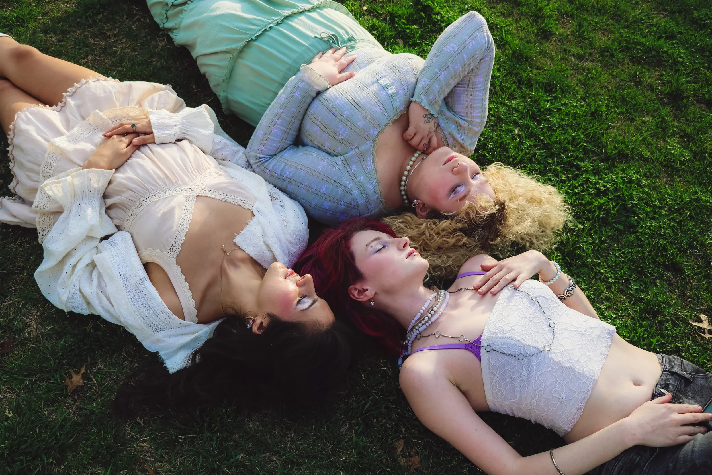
Modeled by: Amelie Carter, Annabella Diaz, and August Ervin
Every year, Pantone, the first company to standardize colors for mass production, highlights a color that they feel will embody the year to come. For 2020, through the COVID-19 pandemic and the start of a new decade, the color was Classic Blue. Pantone introduced the color by describing it as: “Instilling calm, confidence, and connection, this enduring blue hue highlights our desire for a dependable and stable foundation on which to build as we cross the threshold into a new era.” For 2002, after the 9/11 attacks, Pantone labeled True Red as the color of the year, hoping to inspire courage and national unity. The article “The Zeitgeist of colors: Semiotic Analysis of Pantone's® Colors of the Year in the 2000s” delves into these intentions and impacts for all of Pantone’s Color of the Year picks from 2000 to 2009.
As we approach 2026, Pantone has named their next color. The color of 2026, Cloud Dancer, is a warm off-white. The color has been met with intense discourse, with individuals calling it distasteful in current political climates and even joking that the color serves as a “recession indicator”. Opening one Instagram post about Cloud Dancer, the first three comments are (in order) “Recession indicator btw,” “Pantone’s Landlord Special,” and “‘Pantone Has Great Jeans.’” This last one is referencing a 2025 controversy in which an actress with blonde hair, fair skin, and blue eyes was chosen for an advertisement that relied on wordplay between “great genes” and “great jeans.” The ad was met with massive criticism for seemingly promoting tight eurocentric beauty standards and some online went as far as to call the ad white supremecist propaganda. Pantone presents this color in a more positive light.
Pantone’s Color of the Year has massive influence over every industry that has color trends, with the major ones being fashion and furniture. The company is well aware of this and posts their complete vision for these industries along with the color announcement. For fashion, Pantone sees Cloud Dancer as a color of structure and comfort. They paint a picture of pillowy fabrics, relaxation, and a color capable of standing on its own without ever being too much.
Pantone’s website offers several beautiful palettes to pair Cloud Dancer with but, true to their vision of comfort and relaxation, they stick primarily to neutral tones, pastels, and subtle pops of color.
I want to bring Pantone’s explanation for Cloud Dancer to the light and see how it pairs with intense colors and jewel tones. To do this, I created a few Cloud Dancer color palettes of my own.
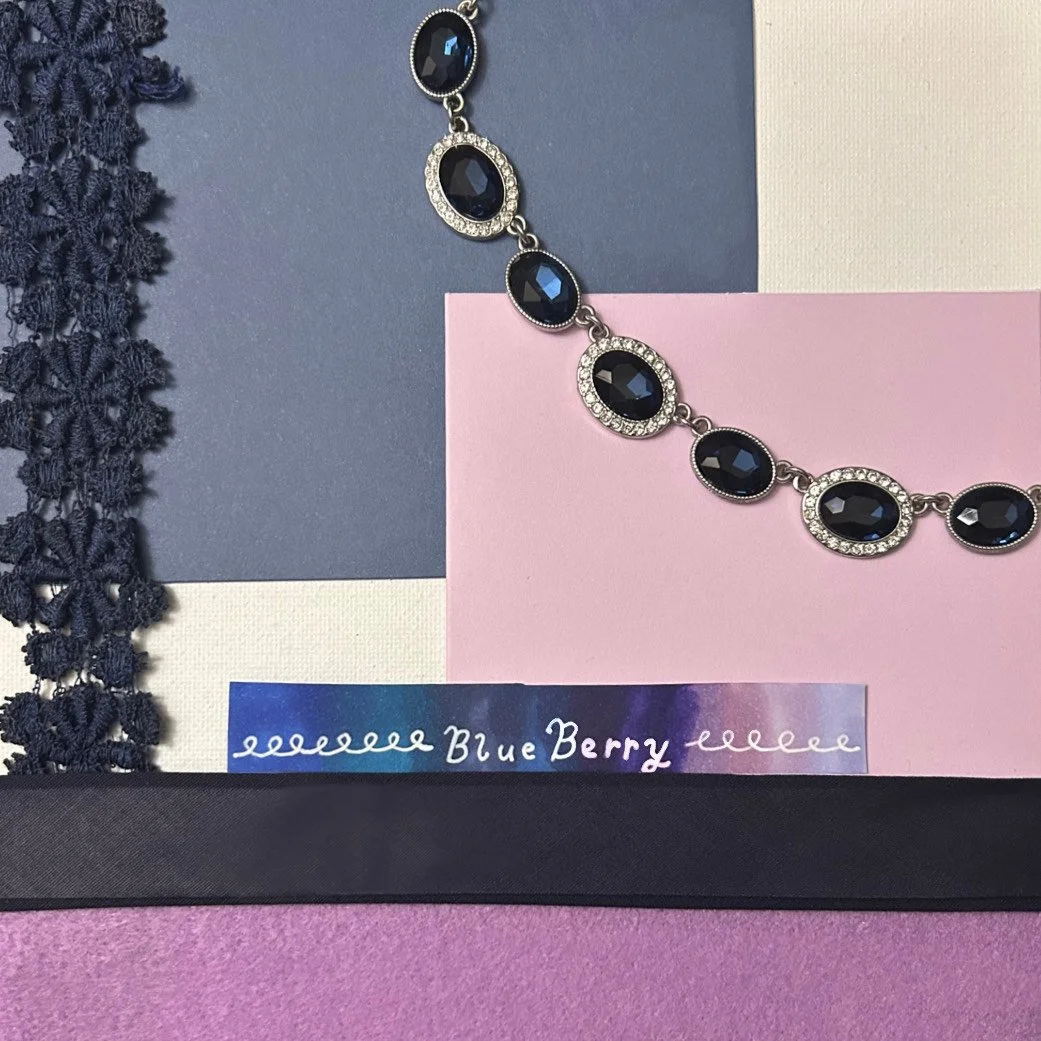
Blueberry: With this palette I wanted to show that the warm undertone doesn’t stop Cloud Dancer from supporting cooler colors. Purple, navy, and royal blue can be beautifully accentuated by that little bit of warmth, making a striking and luxurious palette for those of us with a soft spot for cooler looks.
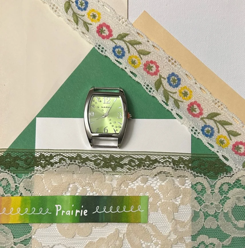
Prairie: Cloud Dancer pairs beautifully with earth tones, but when the base is a form of white, it can be easy to forget how bright the Earth really is. With this combination I wanted to show how we can use shades of white, like Cloud Dancer, to pay homage to Mother Nature in her brightest.
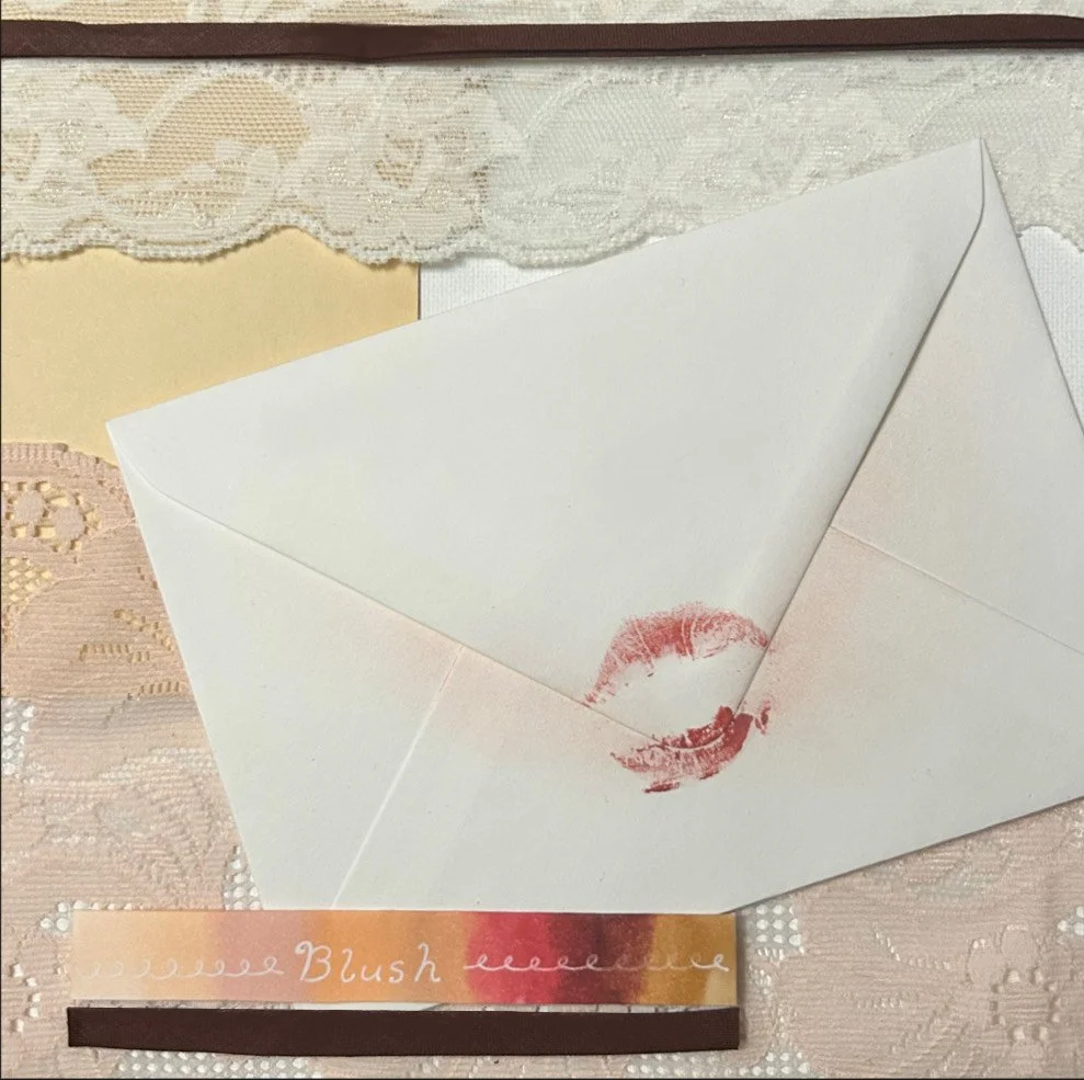
Blush: Sometimes subtly is bold on its own. This combination exemplifies that with a warm, innocent, and still seductive tone. With Cloud Dancer, styling can be as simple as the rouge on your cheeks.
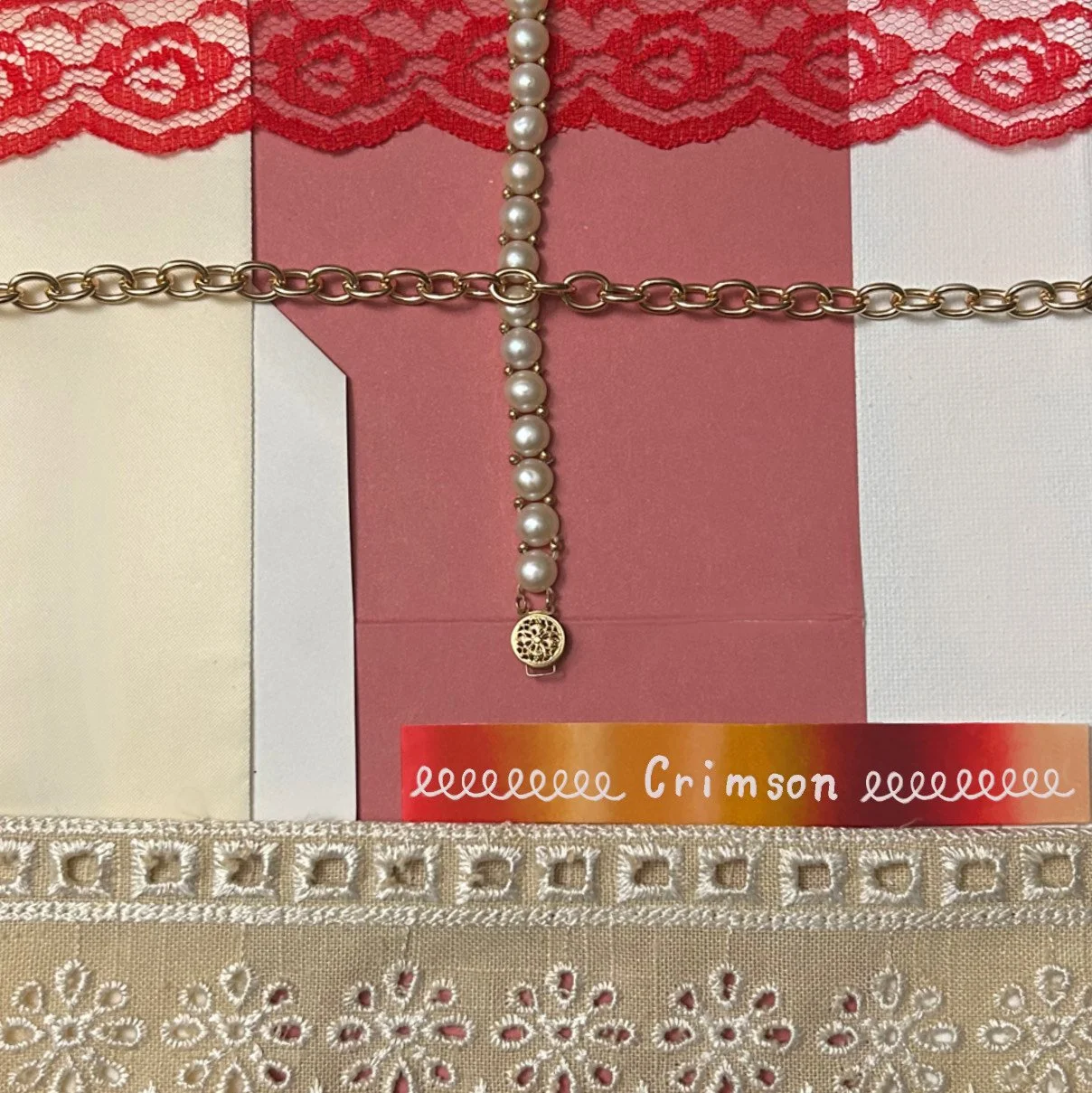
Crimson: This palette draws on Cloud Dancer’s beautiful resemblance to pearls and the way the warm undertone pairs with red and gold. It can be bold, bright, elegant, subtle, and seductive; individually or all at once depending entirely on the whim of the stylist.
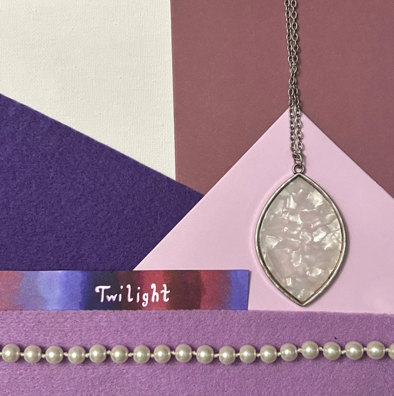
Twilight: For the night owls and stargazers, my Twilight palette shows Cloud Dancer as part of the stars. A small white detail against all the colors of space; the 2026 Color of the Year can be that subtle difference between awe and seeing nothing at all.